CLIENT: Personal Project
AD: Prina de Nooijer
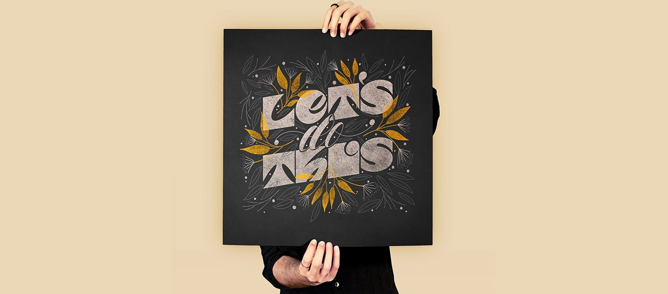
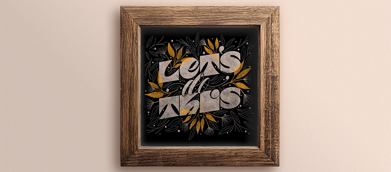
The lettering is the star of this piece. The simple illustrations are to support and frame the bold lettering. I created this piece as a source of motivation for myself and anyone who might need it when I was in a creative slump and needed to make something to get out of my creative rut.
I used a simple color scheme (off-white, grey, mustard yellow) on a black background, which is one of my go-tos because I wanted to avoid overcomplicating things and spent a long time deciding. I know this color palette works! The off-white bold lettering stands out from the black background and supports and reinforces the message “Let’s do This.” I chose to use gray, mustard yellow, and off-white (for the (smaller) illustrations. Hence, they are noticeable but fade into the background simultaneously, making the lettering shine even more.
The result is a beautiful square poster that you can hang prominently in the office when you or your employees need a little motivation!